How did you use media technologies in the construction and research, planning and evaluation stages?
Show every technology I have used and explain how/why I used it/ what it does etc.
For example,
Photoshop – editing album covers
Final cut pro – editing video’s etc
Wednesday, 15 December 2010
Evaluation Question 3 Plan
What have you learned from your audience feedback?
Screen-print comments zoom in on them and analyse them individually on prezi.
• Get audience feedback via Youtube comments etc on both videos.
• Say what I’ve improved, changed etc.
• Use feedback teachers have commented on blog
Screen-print comments zoom in on them and analyse them individually on prezi.
• Get audience feedback via Youtube comments etc on both videos.
• Say what I’ve improved, changed etc.
• Use feedback teachers have commented on blog
Monday, 13 December 2010
Evaluation Question 2 Plan
Explain why my draft ancillary (Much closer to film) wasn’t good enough etc.
Use Photoshop to pick apart album cover, ancilliary and video and compare/contrast them.
Maybe use tubechop/ screenshots to show conventions that match the ancilliary from the video.
Possibly use prezi to present all information.
Elements not included
• I didn’t use hand drawings in the end
• Backgrounds e.g. outside, bedroom etc omitted in ancilliary, very plain background for photo’s
Elements included
• I kept pictures saturated to follow the video’s theme.
• Use of props e.g. ukelele consistently throughout all products.
• Poster incorporates theme of the digipak
• Same costume in all photo’s as in the video
Labels:
evaluation,
plan
Evaluation Question 1 Plan
Tubechop/ screenshot, put into Photoshop, and compare to my media movie product.
Written on hand influence
Daft Punk - Daft Hands-Harder, Better, Faster, Stronger
http://www.youtube.com/watch?v=K2cYWfq--Nw
The Rocket Summer - Do You Feel
http://www.youtube.com/watch?v=mrP9SrMJ00c
Close up on ukulele playing influence
(Also cut off face influence but in this video its upside-down)
NeverShoutNever - Cheatercheaterbestfriendeater (viral video)
http://www.youtube.com/watch?v=7Er1yXWsUjs
Signs Influence
Bob Dylan -Subterrainian homesick blues
http://www.youtube.com/watch?v=2BRYIKWMiHk
Never shout Never – what is love
http://www.youtube.com/watch?v=KA62IuYI6gs
Stop Motion Rain Influence
Motion City Soundtrack - Feel Like Rain - Short version
http://www.youtube.com/watch?v=rE2QpfCg6y8&feature=related
Lighting/Visual Effects Influence
You Me At Six - Stay With Me
http://www.youtube.com/watch?v=ye5ivNkEcwo
Marina And The Diamonds - I Am Not A Robot Remake
http://www.youtube.com/watch?v=syiKyTS8h64
Clothing Influences
Take style from Christofer Drew
Topshop etc.
Digipak & Poster influences already on blog get off blog!
Labels:
evaluation,
plan
Friday, 10 December 2010
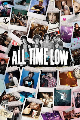
All Time Low Poster
this All TIME LOW poster is a very good example of my idea for my album poster,
as just liike mine it has many photos in the background, of the band just being the band!
i have done much the same as this but with more organized pictures i used inside my album to help
keep continuity thrughout my products.
as just liike mine it has many photos in the background, of the band just being the band!
i have done much the same as this but with more organized pictures i used inside my album to help
keep continuity thrughout my products.

Thursday, 9 December 2010
Wednesday, 8 December 2010
Album poster example
below is an example of a ver stereotypical but simple album cover.
im hopefully going to do my poster in this sort of format,
with the bands name at the top, the album cover in the centre, and an image on the back of the artist.
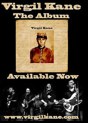
other posters that follow this format are:
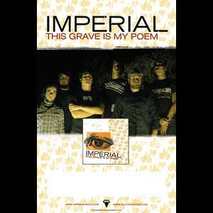
which also incorporates the record label at the very bottom of the poster which i think is a very good thing as it also gains the record company reputation rather than just the artist.
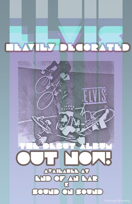
this final picture is just to back up my point that this is a very stereotypical layout for an album poster.
im hopefully going to do my poster in this sort of format,
with the bands name at the top, the album cover in the centre, and an image on the back of the artist.

other posters that follow this format are:

which also incorporates the record label at the very bottom of the poster which i think is a very good thing as it also gains the record company reputation rather than just the artist.

this final picture is just to back up my point that this is a very stereotypical layout for an album poster.
Monday, 6 December 2010
idea
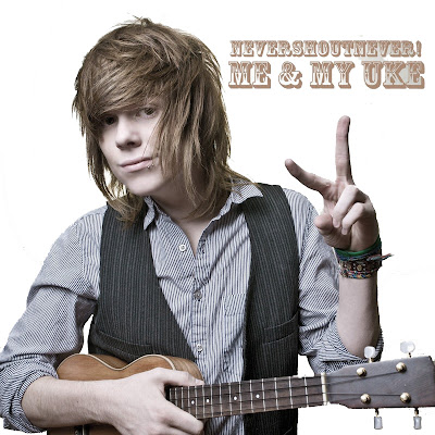
Just another idea of mine, by subtracting all of the background, leaving it plain white, it has a more simplistic feel to the album, and also use the saturated effect to continue with the same feel as my music video, i have done this to the below nevershoutnever cover, to give a feel what it would be like.

Reflection on draft feedback
i have decided to scrap most of my ideas, and try keep the final cover plain and simple.
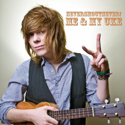
i shall base my final cover style on the chase coy album cover below, with just me standing in the photo, possibly with my ukelele much like in the never shout never cover below.
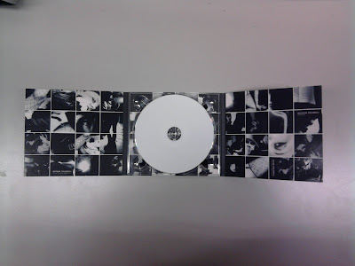
for the inside of my digipak, i will base the idea on that used by the kings of leon, a 4x4 tile pattern of many different pictures, that show what the artist is like, for example, guitars, girls, and faces, giving a very vintage touring feel.
also needed on my album is a barcode on the back in a corner, and also the record label which can be on the front or back cover, and is usually located in a corner.
on the back of my album cover i am thinking of having the reverse of the shot used for the front, for example, on the front you see my face, and on the back you see the back of my head, to give the feel you can see me from all angles, which i believe would give a great effect.
my album poster will go along with this theme, and also probably have my ukelele in it.
i shall base my final cover style on the chase coy album cover below, with just me standing in the photo, possibly with my ukelele much like in the never shout never cover below.

for the inside of my digipak, i will base the idea on that used by the kings of leon, a 4x4 tile pattern of many different pictures, that show what the artist is like, for example, guitars, girls, and faces, giving a very vintage touring feel.

also needed on my album is a barcode on the back in a corner, and also the record label which can be on the front or back cover, and is usually located in a corner.
on the back of my album cover i am thinking of having the reverse of the shot used for the front, for example, on the front you see my face, and on the back you see the back of my head, to give the feel you can see me from all angles, which i believe would give a great effect.
my album poster will go along with this theme, and also probably have my ukelele in it.
Thursday, 2 December 2010
Wednesday, 1 December 2010
Update.
just to show where i am at.
i am currently drawing up my album which shall be self-titled.
i am doing this as it shall be a first album which are usually self-titled.
also for the purpose of the album, im shortening the name of 'cheatercheaterbestfriendeater' to just 'cheater' as it fits with the very simplistic feel to my album.
Monday, 29 November 2010
Chase Coy - Picturesque
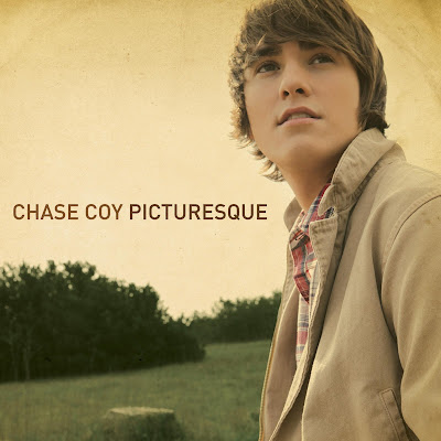
this album cover is made by a similar acoustic artist chase coy.
the simplicity of the cover is very typical of the genre of music it is related to,
also, the colours have been changed much like in my music video.
McSweeney's quarterly concern

the image above is of the 13th issue of McSweeney's quarterly concern.
this magazine shows just how abstract media can be, as this magazine comes out in many different shapes, forms and sizes to display information, for example the one above is described on wikipedia as
'hardcover; dustjacket unfolds into two large artworks; includes two mini-comic'
Wednesday, 24 November 2010
Rain Stop Motion
here is a very short clip that i wish to use in my final video, making it rain on my drawing.
Monday, 22 November 2010
Mock Up Poster
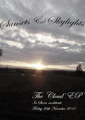
here is a mock up i have done of an EP release for my band
the image (although not my own) contrasts well with the name of the band and the album name.
the writing is fluent throughout album cover, poster and in my music video
i have added an effect using photoshop to desaturise the image to fit my music video's style.
one possible addition i would take during my photo hoot is that i would have the artist walking towards the sunset, wether it be a silhouette or the back of the artist, desaturised.
Monday, 15 November 2010
Music Video Draft Feedback
Level 3 - 30 out of 40 marks
-A good attempt
-Creative use of titles (hand written/drawn) but mise en scene needs lots more care. (5)
-Lipsyncing good
-2 characters styled well, appropriate genre, theme of song
-Some shots very blurry e.g. mobile phone (2)
-Writing on hand and titles must be neater/artier - just not so slapdash (2)(5)
-Hugging scenes look a bit weak
-Calendar element - should move through year instead of repeating same month. (2)(5)
after getting my feedback from my teacher, i understand many things i need to push my work to a level 4, the main issues i need to attend to (numbered according to the mark scheme) are:
(2) framing a shot
(5) mise en scene
these numbers are represented alongside comments to clearly show where the issues have arisen.
Labels:
Feedback
The Academy is... Album Cover
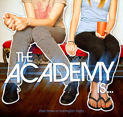
in this album cover by 'the academy is...' i like the very plain and simple aspect to the photography, just two people sat on a stool, with a very simplistic background, drawing your attention to the sitting people. i also like the bands name written across the centre which is highlighted by effects to be very 'in your face' and so people instantly can recognise the fun, poppy genre that the band is, and more importantly, recognise who the band is at first glance. an interesting feature of this album cover is that the name of the album is in very small writing at the very bottom of the cover, and therefore seen last by the viewer.
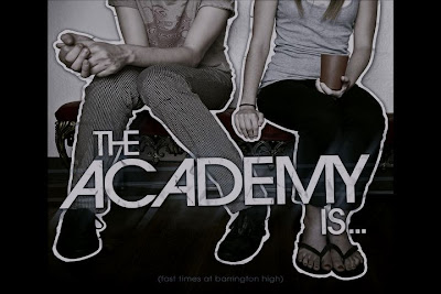
this album cover is a very good representative of the sort of thing i hope to achieve, however i expect i would have the artist in the centre as the main attraction, and also to follow the theme of my music video and its desaturated colour, the album cover will also be desaturated, much like the version i have created below of the original album cover. i believe the desaturation, fitting with the music video, will be a great effect for a video cover giving it an almost 'retro' feel.
Monday, 8 November 2010
Cd Digipak
While researching, i have come across 2 different layouts for Digipaks.
Firstly, there is a layout, The Rollfold Template, in which the CD is at the far right of the Digipak.
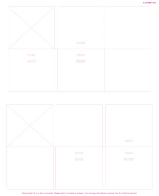
The second, the gatefold design, (which i think much better and will be using) is with the cd in the centre.
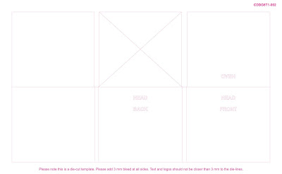
Firstly, there is a layout, The Rollfold Template, in which the CD is at the far right of the Digipak.

The second, the gatefold design, (which i think much better and will be using) is with the cd in the centre.

Friday, 5 November 2010
Music Video Draft
here is my first draft of my media music video coursework.
Wednesday, 27 October 2010
Promo Video
to make the music video seem like a real bands single release, i have put together a promo video of clips from the first shoot.
Evidence of Filming
this video is a video taken on my mac's built in camera just to show how im filming the music video, and as evidence that i am the person that sets up the camera, and the cameraman, even though i'm in the final music video.
Monday, 25 October 2010
Contacting the record company
The following screenshots show the two seperate ways i have contacted loveway records, once through never shout nevrs website, and a second time via twitter.
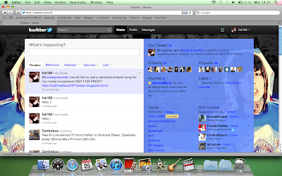
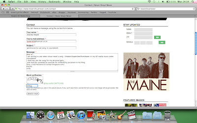


Update/ Filming schedule
the major change that shall happen before filming is the use of a ukelele instead of a guitar as the song uses a ukelele not a guitar on closer inspection.
Filming Schedule
Monday - Me&Rhianne in boys bedroom, room with sofa & outside on bench
Tuesday - Me with Ukelele (hopefully if it comes in the post on time!)
Wednesday - start of initial editing
Thursday Me& Rhianne fiming in boys bedroom, room with sofa & outside on bench (all shots not done on monday/ improved shots to mondays)
Friday - editing in shots taken on thursday
Sunday - finish Filming in girls bedroom
Following week
complete editing and burn to disk for friday.
Thursday, 14 October 2010
Half Term Holiday
as i am going on holiday with my family tomorrow, and wont be back for 10 days, i will not be blogging, as a result of this however, i shall start to catch up asap when i get back
Wednesday, 13 October 2010
Storyboard
this is my storyboard, as you can see below, the slideshare version is numbered, which correlates to my scribd document, where the timings and lyrics are put next to the shot drawing of the storyboard. my animatic represents a working moving version of this as the music is fit perfectly with the shots to give the viewer a complete realization of the idea i want to capture. the only thing i need to do is show the angles of each shot as where some shots are repeated, the angles are different and thus need to put an arrow on the corresponding shot.
Monday, 11 October 2010
Basic Narrative
Narrative
The above narrative is a very basic idea of what will happen within my music video, this is essentially the skeleton of my music video and my storyboard should hopefully fill this out in much more depth.
The above narrative is a very basic idea of what will happen within my music video, this is essentially the skeleton of my music video and my storyboard should hopefully fill this out in much more depth.
Labels:
Music Video,
Narrative
Wednesday, 6 October 2010
Editing Idea's
the light is edited on this music video to create a very polished finish, with the colours very vibrant and giving it a surreal look. this video shows the effect in which i wish to create within my video relating to my previous posts with the walk through on how to do it, and also the 'marina and the diamonds remake' that i have posted and spoken about previously. also this and the marina video both use very simple imagery, with the use of editing to give a great impact on the audience.
Monday, 4 October 2010
Editing Techniques
using Final Cut Pro 7 and iMovie, i will construct my final video, iMovie for its simplicity and ease, to fit my video in place, and Final Cut Pro 7 to add the finishing touches, the video below shows what sort of effect i will try and use within my music video amongst others, to give it a more professional look, and also this video gives a step by step guide on how to do this.
Create the Film Look from Zach on Vimeo.
Labels:
A2 Coursework,
Editing,
Music Video
Representation
Representation Media A2
This document shows my ideal representation for characters, settings and the props needed within my music video.
This document shows my ideal representation for characters, settings and the props needed within my music video.
Never Shout Never
Never Shout Never 2
as the clip is always on the second beat, i will use this in conjunction with the lyrics to decide where to put my clips, here is my rough idea of where the clips will go within the song.
as the clip is always on the second beat, i will use this in conjunction with the lyrics to decide where to put my clips, here is my rough idea of where the clips will go within the song.
Thursday, 30 September 2010
Marina And The Diamonds - I Am Not A Robot Remake
this music video remake is exceptionally good, and although i would like my video to be this good, the problem is the limit of technology i can us, this person has used approx £3000 of equiptment! but it shows, for my video i will use alternatives but hopefully try capture the same sort of experience within my video, and would like to try get effects to make it stand out from the crowd, much like this video uses 'Magic Bullet Looks' to enhance the visual within the video, i am hoping i can use effects to enhance my shots such as desaturation, and also adjusting the brightness and contrast can have similar effects.
Thursday, 23 September 2010
inspirational video idea
in my video, i would like to use written signs to enhance strong parts of the song such as when feelings need to be conveyed or just for added effect, in the tubechop below, alongside the use of signs to convey feelings, the video has a sort of scribble of notes all over it but i dont think with the technology available to me at present, i am able to recreate this more professional effect.
Wednesday, 22 September 2010
Romance on a Rocketship - Skin & Bones music video analysis
this song and video's storyline is about the lead singer falling in love with a girl, and he is trying to get her to be his.
in this tubechop, there is a lot of illustrated footage as the song says 'With your long, long hair and your big, blue eyes' at big blue eyes, the girl opens her eyes revealing they are blue as illustrated in the song.
in this clip, the use of a lion shows disjunction from the song, however when the words 'but back it up' are played it shows the teacher running away from the lion or 'backing up' showing some illustration between the video and the song.
this tubechop shows complete illustration between the song and music video as when the words' i sure think you're beautiful' are played, in the video the girl opens a letter that says exactly the same on it.
The Ready Set - Love Like Woe Music Video Analysis
This songs storyline is about how a couple falls in and out of love again. one moment he feels like theyre so in love with each other, but then she ignores him and moves on, and the cycle keeps repeating, however the video storyline has complete disjuncture with this as its about a house party in the woods with zombies trying to take the lead singer away.
in this section of the music video, you can see the disjunctive nature as the video shows zombies whilst the song is singing about 'how could i say no' referring to the girl and how even though their relationship is broken at best, he always goes back to her.
in this tubechop, the girl he is in love with has come back to him but is quickly snatched away again by the zombies, which shows some illustration as the words 'the timing and the moment seemed so right' but just like their relationship, another person takes her away from him.
this tubechop shows the end of the music video which has a total disjuncture to the song, as the lead singer is taken by the zombies and turned into one at the end of the video.
Never Shout Never - Big City Dreams Music Video Analysis
this video's storyline and song is about a boy, singing to his girlfriend about how he knows she wants to leave and he kind of accepts it, but he'd rather she stayed, because he knows he's going to be left behind and he's going to miss her. he wants her to be happy here, because he wants to stay with her, but in the end he lets her go as he is literally weighing her down with the piece of string.
this initial tubechop shows a very illustrated piece of footage where as the words "pack up all my things and get my ass outta town." play, the video literally shows a girl packing her things into a bag and walking out of the door.
This tubechop amplifies the tying her down aspect of the video as it shows she is tied to a string that is with him, in this scene also, there are many closeups of Christopher (never shout never's artist) as we are familiarised to the singer, so we can empathise with his feelings of the girl walking away from him.
This final tubechop also amplifies the tying her down feeling as she is like a kite flying in the air and he finally has to let go, which signifies the end and also the end of the song.
Music Video Moodboard
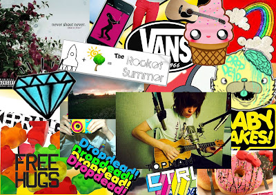 My moodboard incorporates all aspects of what my target audience shall be and aspects of what my music video will require. the 'indie' style of topman mixed with the 'scene' syle of babycakes & dropdead clothing shows the style of clothing i will have to wear in the video to keep in sync with the bands style, also i have used images suck as sweets, doughnuts & pokemon to add a childish element which the band conveys, whilst still holding its seriousness within the lyrics of songs.
My Music Video Genre/ Song
my music genre is Indie Acoustic Pop, and the song i am going to use is CheaterCheaterBestFriendEater by Never Shout Never.
Tuesday, 21 September 2010
Post-production
during Post-production some problems we had were that we found it difficult to match up lip syncing shots to the song we put over the top, and as a result a lot of shots had to be cut short, slowed down or sped up to fit this together properly, showing that we really should have refilmed some of the video, but due to the time constraints, we couldn't do this. a lot of work had been put into editing this video, with 2 lessons and countless hours outside lessons spent on editing (all taking turns) to come up with a final piece, another problem with editing is that we had to use the very basic video editing software on the macs, and therefore for my final piece i think i will have to find an alternative software to this.
in conclusion, i have found out that there are many difficulties in making music videos, and that it shall be very hard work to make my own final piece, however, i am very confident i can complete my final piece in time and to a standard that i am happy with, doing this task mhas also enlightened me on filming/ editing techniques which will benefit my final piece as a result.
in conclusion, i have found out that there are many difficulties in making music videos, and that it shall be very hard work to make my own final piece, however, i am very confident i can complete my final piece in time and to a standard that i am happy with, doing this task mhas also enlightened me on filming/ editing techniques which will benefit my final piece as a result.
Busted Remake
Our task was to remake the first 1 minute and 14 seconds of Busted's 'What i go to school for' music video, within 8 lessons, here is the finished product, and you will find the pre production, production & post production posted also on my blog.
Monday, 20 September 2010
Production
During the production of the video, as a class we decided to use the e-learning centre to film the classroom scenes, as it had the same sort of bland classroom as in the video, with enough lighting from windows to give us clear shots. We had to make sure that everyone was in the right place at the right time doing the right thing, with the camera rolling in the right place, which, although being a rigorous task I believe as a team we overcame all obstacles however, Some problems we faced were that scenes where the classroom was meant to be dark were hard to shoot, therefore reducing the quality of film that we could get, and also as mentioned above, it took a few takes to get the shots just right due to acting and lip syncing.
Pre Production
During the Pre Production part of making the remake of ‘busted – what I go to school for’ we had to plan a detailed storyboard of the video that we were re making. Every shot within the clip needed to be analysed specifically for the timing, shot angle & setting of the shot, so we could get all of the props and find a suitable place to shoot the video. We did this by repeatedly watching the video over and over, and by stopping it at every different shot to analyse what we were seeing. Also in pre production, we practised lip syncing for the film, as this is quite a hard process and takes very accentuated lip movements to get the right effect, this posed another problem in the video, as it took a few takes in production to get it just right.
Subscribe to:
Comments (Atom)


