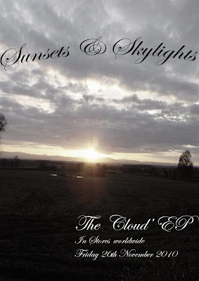
here is a mock up i have done of an EP release for my band
the image (although not my own) contrasts well with the name of the band and the album name.
the writing is fluent throughout album cover, poster and in my music video
i have added an effect using photoshop to desaturise the image to fit my music video's style.
one possible addition i would take during my photo hoot is that i would have the artist walking towards the sunset, wether it be a silhouette or the back of the artist, desaturised.
Andy. I'm not too sure if the picture of a Sunset is too literal. Do some more research into digi pack covers for bands from a similar genre. Find out what features prominantly on the covers (is it the artist or merely images?)
ReplyDeletethere is too much of a difference between the digipak cover idea and the poster idea. where is the band/brand identity?
ReplyDeleteyou need to make sure that your final decisions for both go together well, that they are recognisably for your band. the countryside shot would need some justification because it doesn't seem to fit with anything you've produced or used as examples so far. i am aware that it is a mockup and unfinished but it needs to give a strong idea about the final version. does it do this?
ReplyDelete