i shall base my final cover style on the chase coy album cover below, with just me standing in the photo, possibly with my ukelele much like in the never shout never cover below.

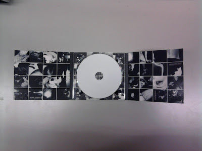
for the inside of my digipak, i will base the idea on that used by the kings of leon, a 4x4 tile pattern of many different pictures, that show what the artist is like, for example, guitars, girls, and faces, giving a very vintage touring feel.

also needed on my album is a barcode on the back in a corner, and also the record label which can be on the front or back cover, and is usually located in a corner.
on the back of my album cover i am thinking of having the reverse of the shot used for the front, for example, on the front you see my face, and on the back you see the back of my head, to give the feel you can see me from all angles, which i believe would give a great effect.
my album poster will go along with this theme, and also probably have my ukelele in it.
No comments:
Post a Comment