Monday, 29 November 2010
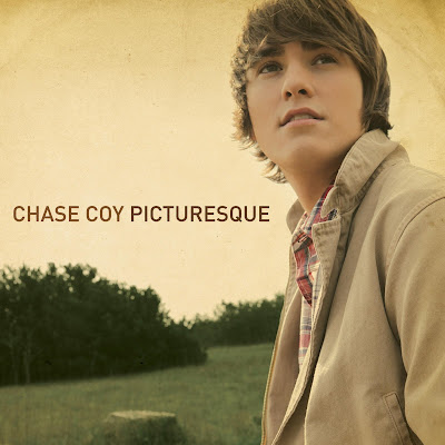
Chase Coy - Picturesque
this album cover is made by a similar acoustic artist chase coy.
the simplicity of the cover is very typical of the genre of music it is related to,
also, the colours have been changed much like in my music video.
McSweeney's quarterly concern
the image above is of the 13th issue of McSweeney's quarterly concern.
this magazine shows just how abstract media can be, as this magazine comes out in many different shapes, forms and sizes to display information, for example the one above is described on wikipedia as
'hardcover; dustjacket unfolds into two large artworks; includes two mini-comic'
Wednesday, 24 November 2010
Rain Stop Motion
here is a very short clip that i wish to use in my final video, making it rain on my drawing.
Monday, 22 November 2010
Mock Up Poster
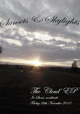
here is a mock up i have done of an EP release for my band
the image (although not my own) contrasts well with the name of the band and the album name.
the writing is fluent throughout album cover, poster and in my music video
i have added an effect using photoshop to desaturise the image to fit my music video's style.
one possible addition i would take during my photo hoot is that i would have the artist walking towards the sunset, wether it be a silhouette or the back of the artist, desaturised.
Monday, 15 November 2010
Music Video Draft Feedback
Level 3 - 30 out of 40 marks
-A good attempt
-Creative use of titles (hand written/drawn) but mise en scene needs lots more care. (5)
-Lipsyncing good
-2 characters styled well, appropriate genre, theme of song
-Some shots very blurry e.g. mobile phone (2)
-Writing on hand and titles must be neater/artier - just not so slapdash (2)(5)
-Hugging scenes look a bit weak
-Calendar element - should move through year instead of repeating same month. (2)(5)
after getting my feedback from my teacher, i understand many things i need to push my work to a level 4, the main issues i need to attend to (numbered according to the mark scheme) are:
(2) framing a shot
(5) mise en scene
these numbers are represented alongside comments to clearly show where the issues have arisen.
Labels:
Feedback
The Academy is... Album Cover
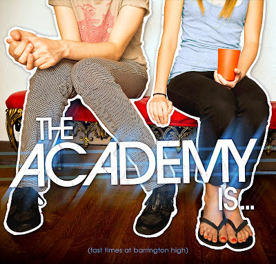
in this album cover by 'the academy is...' i like the very plain and simple aspect to the photography, just two people sat on a stool, with a very simplistic background, drawing your attention to the sitting people. i also like the bands name written across the centre which is highlighted by effects to be very 'in your face' and so people instantly can recognise the fun, poppy genre that the band is, and more importantly, recognise who the band is at first glance. an interesting feature of this album cover is that the name of the album is in very small writing at the very bottom of the cover, and therefore seen last by the viewer.
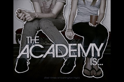
this album cover is a very good representative of the sort of thing i hope to achieve, however i expect i would have the artist in the centre as the main attraction, and also to follow the theme of my music video and its desaturated colour, the album cover will also be desaturated, much like the version i have created below of the original album cover. i believe the desaturation, fitting with the music video, will be a great effect for a video cover giving it an almost 'retro' feel.
Monday, 8 November 2010
Cd Digipak
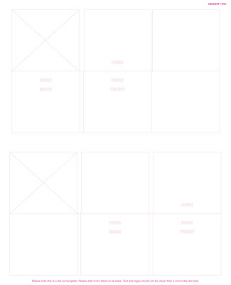
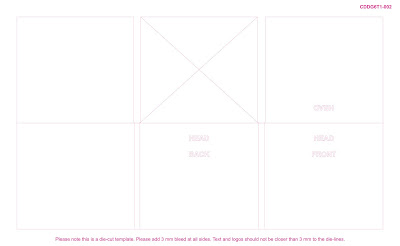
While researching, i have come across 2 different layouts for Digipaks.
Firstly, there is a layout, The Rollfold Template, in which the CD is at the far right of the Digipak.
The second, the gatefold design, (which i think much better and will be using) is with the cd in the centre.
Firstly, there is a layout, The Rollfold Template, in which the CD is at the far right of the Digipak.
The second, the gatefold design, (which i think much better and will be using) is with the cd in the centre.
Friday, 5 November 2010
Music Video Draft
here is my first draft of my media music video coursework.
Subscribe to:
Posts (Atom)