How did you use media technologies in the construction and research, planning and evaluation stages?
Show every technology I have used and explain how/why I used it/ what it does etc.
For example,
Photoshop – editing album covers
Final cut pro – editing video’s etc
Wednesday, 15 December 2010
Evaluation Question 3 Plan
What have you learned from your audience feedback?
Screen-print comments zoom in on them and analyse them individually on prezi.
• Get audience feedback via Youtube comments etc on both videos.
• Say what I’ve improved, changed etc.
• Use feedback teachers have commented on blog
Screen-print comments zoom in on them and analyse them individually on prezi.
• Get audience feedback via Youtube comments etc on both videos.
• Say what I’ve improved, changed etc.
• Use feedback teachers have commented on blog
Monday, 13 December 2010
Evaluation Question 2 Plan
Explain why my draft ancillary (Much closer to film) wasn’t good enough etc.
Use Photoshop to pick apart album cover, ancilliary and video and compare/contrast them.
Maybe use tubechop/ screenshots to show conventions that match the ancilliary from the video.
Possibly use prezi to present all information.
Elements not included
• I didn’t use hand drawings in the end
• Backgrounds e.g. outside, bedroom etc omitted in ancilliary, very plain background for photo’s
Elements included
• I kept pictures saturated to follow the video’s theme.
• Use of props e.g. ukelele consistently throughout all products.
• Poster incorporates theme of the digipak
• Same costume in all photo’s as in the video
Labels:
evaluation,
plan
Evaluation Question 1 Plan
Tubechop/ screenshot, put into Photoshop, and compare to my media movie product.
Written on hand influence
Daft Punk - Daft Hands-Harder, Better, Faster, Stronger
http://www.youtube.com/watch?v=K2cYWfq--Nw
The Rocket Summer - Do You Feel
http://www.youtube.com/watch?v=mrP9SrMJ00c
Close up on ukulele playing influence
(Also cut off face influence but in this video its upside-down)
NeverShoutNever - Cheatercheaterbestfriendeater (viral video)
http://www.youtube.com/watch?v=7Er1yXWsUjs
Signs Influence
Bob Dylan -Subterrainian homesick blues
http://www.youtube.com/watch?v=2BRYIKWMiHk
Never shout Never – what is love
http://www.youtube.com/watch?v=KA62IuYI6gs
Stop Motion Rain Influence
Motion City Soundtrack - Feel Like Rain - Short version
http://www.youtube.com/watch?v=rE2QpfCg6y8&feature=related
Lighting/Visual Effects Influence
You Me At Six - Stay With Me
http://www.youtube.com/watch?v=ye5ivNkEcwo
Marina And The Diamonds - I Am Not A Robot Remake
http://www.youtube.com/watch?v=syiKyTS8h64
Clothing Influences
Take style from Christofer Drew
Topshop etc.
Digipak & Poster influences already on blog get off blog!
Labels:
evaluation,
plan
Friday, 10 December 2010
All Time Low Poster
this All TIME LOW poster is a very good example of my idea for my album poster,
as just liike mine it has many photos in the background, of the band just being the band!
i have done much the same as this but with more organized pictures i used inside my album to help
keep continuity thrughout my products.
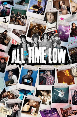
as just liike mine it has many photos in the background, of the band just being the band!
i have done much the same as this but with more organized pictures i used inside my album to help
keep continuity thrughout my products.

Thursday, 9 December 2010
Wednesday, 8 December 2010
Album poster example
below is an example of a ver stereotypical but simple album cover.
im hopefully going to do my poster in this sort of format,
with the bands name at the top, the album cover in the centre, and an image on the back of the artist.

other posters that follow this format are:
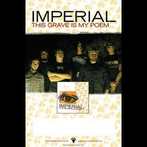
which also incorporates the record label at the very bottom of the poster which i think is a very good thing as it also gains the record company reputation rather than just the artist.
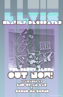
this final picture is just to back up my point that this is a very stereotypical layout for an album poster.
im hopefully going to do my poster in this sort of format,
with the bands name at the top, the album cover in the centre, and an image on the back of the artist.

other posters that follow this format are:

which also incorporates the record label at the very bottom of the poster which i think is a very good thing as it also gains the record company reputation rather than just the artist.

this final picture is just to back up my point that this is a very stereotypical layout for an album poster.
Monday, 6 December 2010
idea
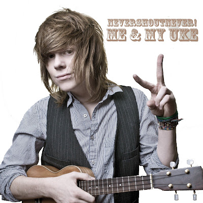
Just another idea of mine, by subtracting all of the background, leaving it plain white, it has a more simplistic feel to the album, and also use the saturated effect to continue with the same feel as my music video, i have done this to the below nevershoutnever cover, to give a feel what it would be like.

Reflection on draft feedback
i have decided to scrap most of my ideas, and try keep the final cover plain and simple.
i shall base my final cover style on the chase coy album cover below, with just me standing in the photo, possibly with my ukelele much like in the never shout never cover below.
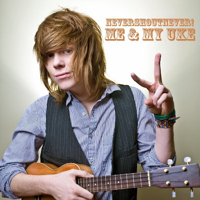
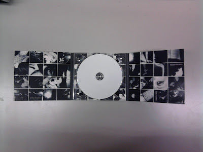
for the inside of my digipak, i will base the idea on that used by the kings of leon, a 4x4 tile pattern of many different pictures, that show what the artist is like, for example, guitars, girls, and faces, giving a very vintage touring feel.
also needed on my album is a barcode on the back in a corner, and also the record label which can be on the front or back cover, and is usually located in a corner.
on the back of my album cover i am thinking of having the reverse of the shot used for the front, for example, on the front you see my face, and on the back you see the back of my head, to give the feel you can see me from all angles, which i believe would give a great effect.
my album poster will go along with this theme, and also probably have my ukelele in it.
i shall base my final cover style on the chase coy album cover below, with just me standing in the photo, possibly with my ukelele much like in the never shout never cover below.

for the inside of my digipak, i will base the idea on that used by the kings of leon, a 4x4 tile pattern of many different pictures, that show what the artist is like, for example, guitars, girls, and faces, giving a very vintage touring feel.

also needed on my album is a barcode on the back in a corner, and also the record label which can be on the front or back cover, and is usually located in a corner.
on the back of my album cover i am thinking of having the reverse of the shot used for the front, for example, on the front you see my face, and on the back you see the back of my head, to give the feel you can see me from all angles, which i believe would give a great effect.
my album poster will go along with this theme, and also probably have my ukelele in it.
Thursday, 2 December 2010
Wednesday, 1 December 2010
Update.
just to show where i am at.
i am currently drawing up my album which shall be self-titled.
i am doing this as it shall be a first album which are usually self-titled.
also for the purpose of the album, im shortening the name of 'cheatercheaterbestfriendeater' to just 'cheater' as it fits with the very simplistic feel to my album.
Subscribe to:
Comments (Atom)


